Apologies for my non existent posts this week, my excuses range from catching up on housework after children were home on a 2 week break from school, assignments due for my design studies and a faulty internet cable *exhales*
Today was a gorgeous day as the sun was warm and bright and bff Brook and I took ourselves off to the Sydney HIA home show :)
I'd never been to a home show before so I wasn't sure what to expect and to be honest, I was a little disappointed. I thought there would be more of the photo's above and below. Displays of various companies showcasing their products as a collaboration. More rooms as a whole on display. Kitchens with furniture and flooring. Bathrooms complete. That kinda thing. Instead is was mainly individual companies with small samples in small booths. The exhibition hall in Sydney consist of 5 halls and the home show only used 3. The other 2 were reserved for another show. I feel they could have easily used all 5 and displayed items on a much grander scale.
This is all just my simple opinion but I left there feeling completely uninspired.
Thank God for the Home Beautiful magazine designers section! Although the displays put together were mostly contemporary styles and I'm more of a traditional girl there were many aspects of these booths I admired.
The two pictures above and below this text were my favourite of all the rooms. This was a classic mix of modern and traditional and definately gives you the feeling of glamour without too much opulence.
"The parlour room"
"An intimate sitting room framed by 1950's inspired paneled wall . The room design includes an antique carved gilt lounge upholsted in custom print black linen by Publisher textiles mixed with contemporary chairs and Kimono cushions. Perfect for high tea".
"Luxury"
"LUXURY: ORIGIN - from Latin luxuria, from luxus ‘excess’."A state of great comfort and extravagant living" "An inessential but desirable item".
Our bedroom is a place for languorous repose and indulgence of the senses, enveloping the inhabitants in a calm cocoon of warmth and sensuality. It is a space to in which to linger, to dream, to love.
Come in, relax & forget the world. . . . "
Our bedroom is a place for languorous repose and indulgence of the senses, enveloping the inhabitants in a calm cocoon of warmth and sensuality. It is a space to in which to linger, to dream, to love.
Come in, relax & forget the world. . . . "
 warm and inviting
"The Retreat"
"In this haphazard world that we live in, my ultimate luxury is time. Time away from the realities of life, time to reflect and time to be alone. My retreat is not compromised by the opinions and expectations of other people and is a place to call ones own, to sit, read, listen to music or just relax".
 Brook and I both love the colours of steel blue and chocolate in this eclectic living room
 (Booth by Baxter Creative)
http://www.baxtercreative.com.au/

"Home Office/Kids Play Area"
"Think left and think right and think low and think high. Oh, the thinks you can think up if only you try! Dr. Seuss"
"Designers: Joanne McWhinney, Jelena PascuttiniDesign Practice: KIDS IN DESIGNED SPACES Design Intent: Using the play pen concept in reverse we have designed a room where the working from home parent can interact with their small child and still work with less disruption."
 Personally I wasn't fussed with this room
 (Booth by Kids in designed spaces)
http://www.kidsindesignedspaces.com.au/
 ^ centre stage
"Luxurious"
"As the world becomes obsessed with brands, labels, and the consumption of indulgent luxury, it is becoming noticeably more difficult to define or find…even if you are unsure of its definition, it’s right in front of you, our luxury is hard to miss!
Luxury is about seducing the luxury seeking person with a luxurious product.
Revitalising all the senses and providing a persistent and passionate plethora of material objects that saturate and permeate our lifestyles. These objects beautify our wardrobes, grace our living rooms, hide in our jewellery boxes and adorn our bodies!
See, feel, touch, admire, sit, lay, taste - its all here to experience. This space is a celebration of everything that is totally unnecessary and everything necessary to express luxury.
This room will seduce you with its style, total indulgence and outright decadence by showing you a perfect product that oozes luxury to the point of no return…we know you want it!"
 Austin Powers eat your heart out! With velvet walls, shagpile floors, black shinny tiling, split levels, stocked bar, spot lights, plasma tv, mirrored feature wall, hot tub at the foot of the bed - You're bound to find your mojo in a pad like this!
 If you look closely this booth even came with a sexy model complete with black speedos for our viewing pleasure LOL
 "Working Studio"
"Pride of place in the open plan’ is what this working studio manifests for the liberated individual. Inspired by the exciting era of sleek modernism, bold geometrics and vivid colour - all in all to want creativity and transformation.
The kitchen is celebrated as the engine room of the home, yet is existent as a workstation to assemble balance and flexibility among all household tasks. Additionally in sight are combinations of textured and smooth surfaces giving added contrast, as well as touches of innocent and feminine pastels to create a wise, relaxed and freedom of space."
"A garden in hell"
"Inspired by Diana Vreeland’s Park Avenue, New York Apartment.The room design includes scarlet floral wall coverings, red lacquer, scarlet furniture, red carpets, cushions, animal skins, black bamboo and gilded mirrors.“Red is the great clarifier – bright and revealing. I can’t imagine becoming bored with red…it would be like becoming bored with the person you love.” Diana Vreeland".
"Modern glam"
"Eclectic seating includes custom red snake print Louis 15th chair, JD ‘flow’ sofa and JD modern wingback chaise. Feature chandelier and ornamental mirror highlight contrasting textures throughout the room (the tassels and wallpaper). Flames from JD ‘eco burner’ coffee table and custom timber bench add ambience and natural warmth".
"The Greg Natale designer room"
"The Greg Natale designer room is an exercise in over scaled furniture, luxurious textures and the contrast of light and dark. Comfortable chic meets Jetsetter lounge is created using a mix of slick furnishings and Mid Century ornaments. The dark reflective surfaces of the design create a sumptuous setting for the late-night guests".
I must say that tripod lamp is pretty fabulous!
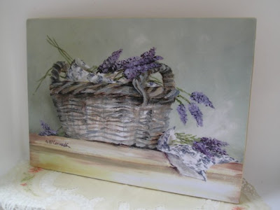
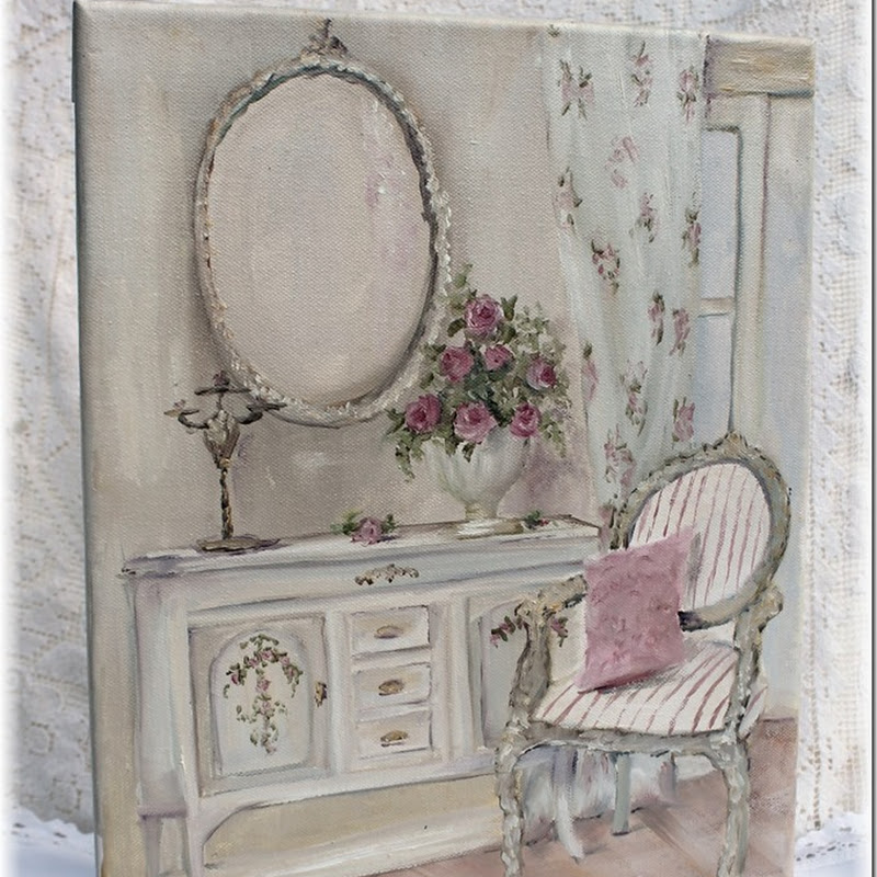
I'd also like to say a special thank you to my new blogging pal Mz Gail McCormack :)
I recently purchased by first original painting from her, which I adore and to my complete surprise and sheer delight Gail also sent me two of her beautiful gift cards made from her original paintings (I couldn't resist framing the lavender basket). As the photo's show I have displayed my new treasures proudly.
Gail, thank you ever so much. Your paintings have made my home even more lovely :)


1 comment:
Hi Anna
Thanks for the tour! WOW lots of beautiful photos. Sounds quite overwhelming.
Glad your rooster arrived safe and sound, he looks great in his new home.
Post a Comment